
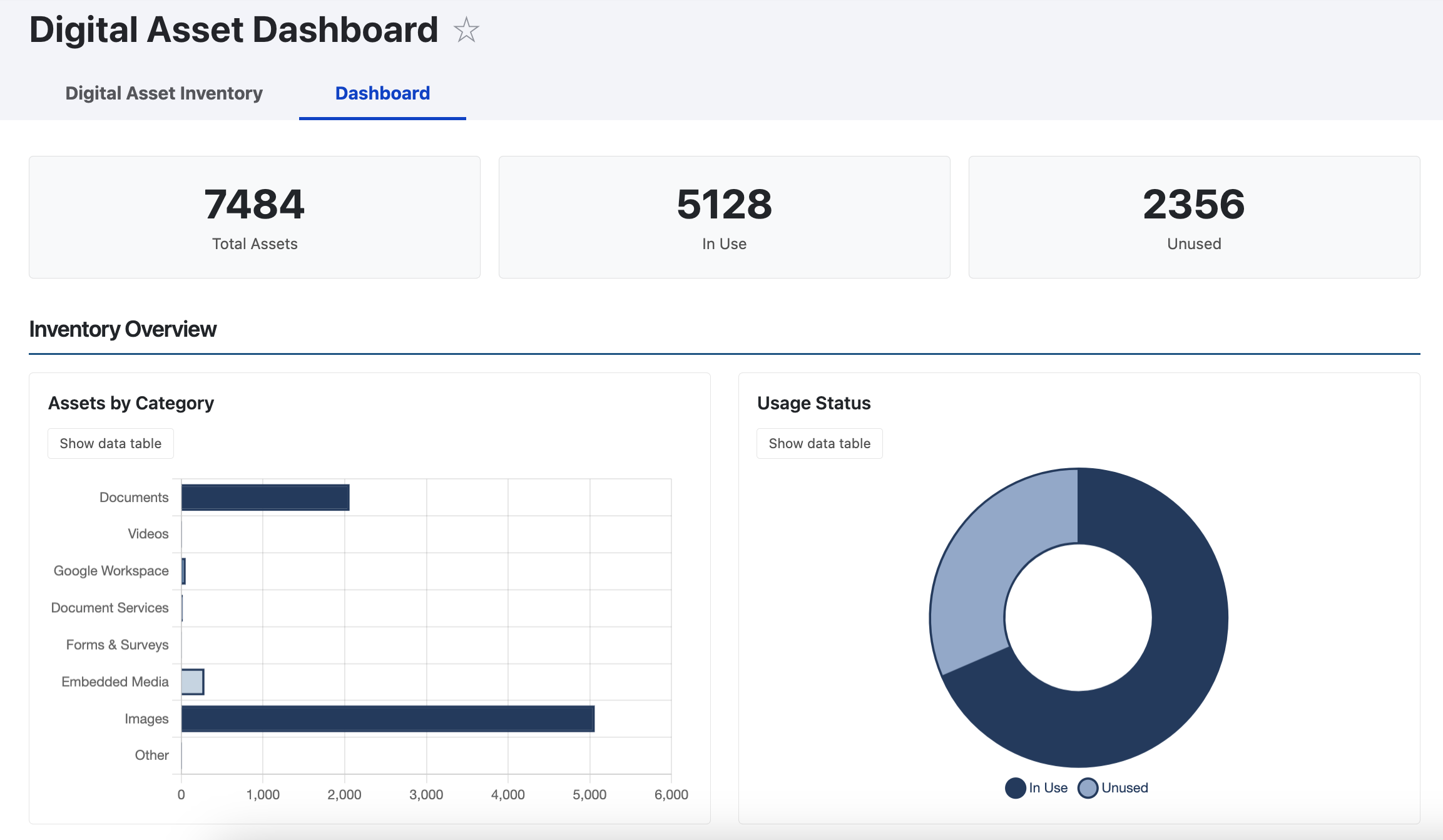
The dashboard provides a visual overview of your inventory using interactive charts. Access it at /admin/digital-asset-inventory/dashboard or via the Dashboard tab on the inventory page.
Dashboard Sections
| Section | What It Shows |
|---|---|
| Summary Bar | Total Assets, In Use, Unused, and Archived (when archiving is enabled) |
| Inventory Overview | Assets by Category (horizontal bar chart) and Usage Status (doughnut chart) |
| Location & Top Assets | Assets by Location (pie chart) and Top 10 Assets by Usage (table) |
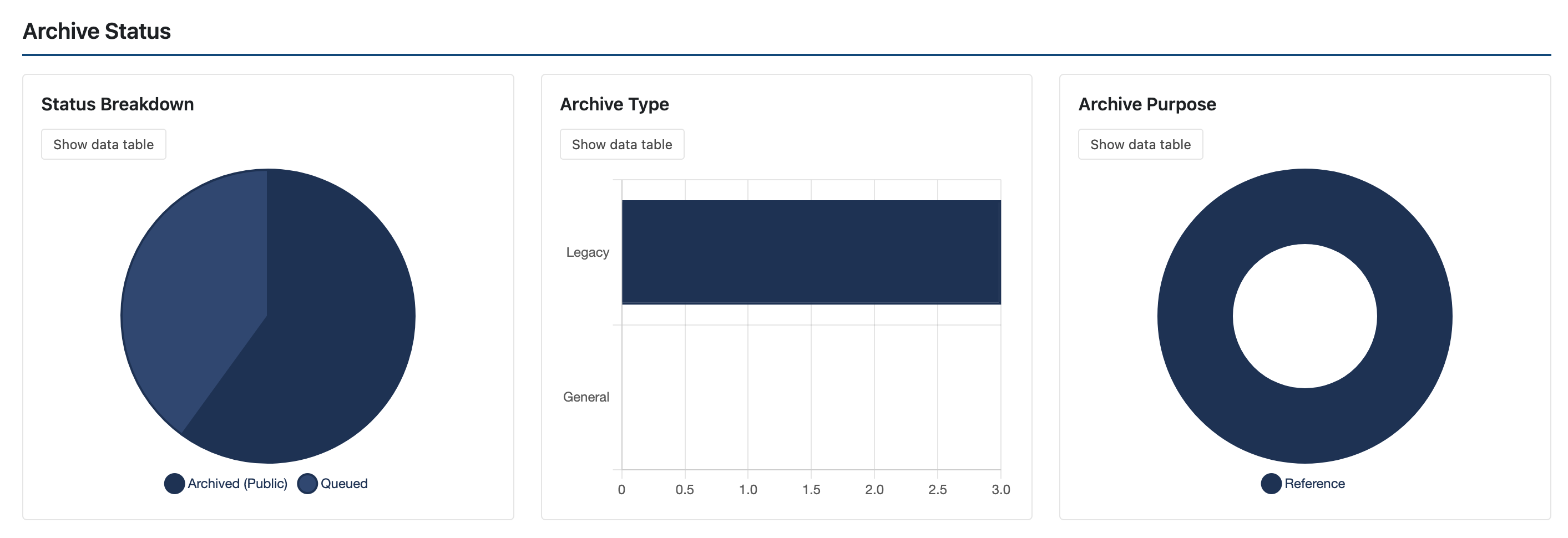
| Archive Status | Status breakdown (pie), Archive Type (bar), and Archive Purpose (doughnut). Only visible when archiving is enabled. |
Chart/Table Toggle
Each chart has a Show data table button that switches between the chart and a data table. This is useful for users who prefer tabular data or use assistive technology. Toggle buttons appear after charts load successfully.
Accessibility and Responsiveness
- Charts use a colorblind-safe gray-blue palette
- All chart data is available as accessible fallback tables
- Animations respect the user's reduced motion preference
- On tablets, the 3-column archive grid becomes 2 columns
- On mobile, all grids collapse to single column and tables switch to a stacked card layout